Service Redesign
Partnering with a local coffee shop Kafka, making the customers experience more efficient, cozy and enjoyable through interaction design methods.
Services
Brand Design
UX Design
Scope
1 month
Industries
Food and Beverage
Date
January 2023
My objective was to design a thorough experience that delights, comforts, and brings a feeling of belonging to the customer.
Rather than a narrow definition of “new service”, I broadened the brief to customer experience where service would be materialized through actions performed for the customers or through physical products.
Primary Research
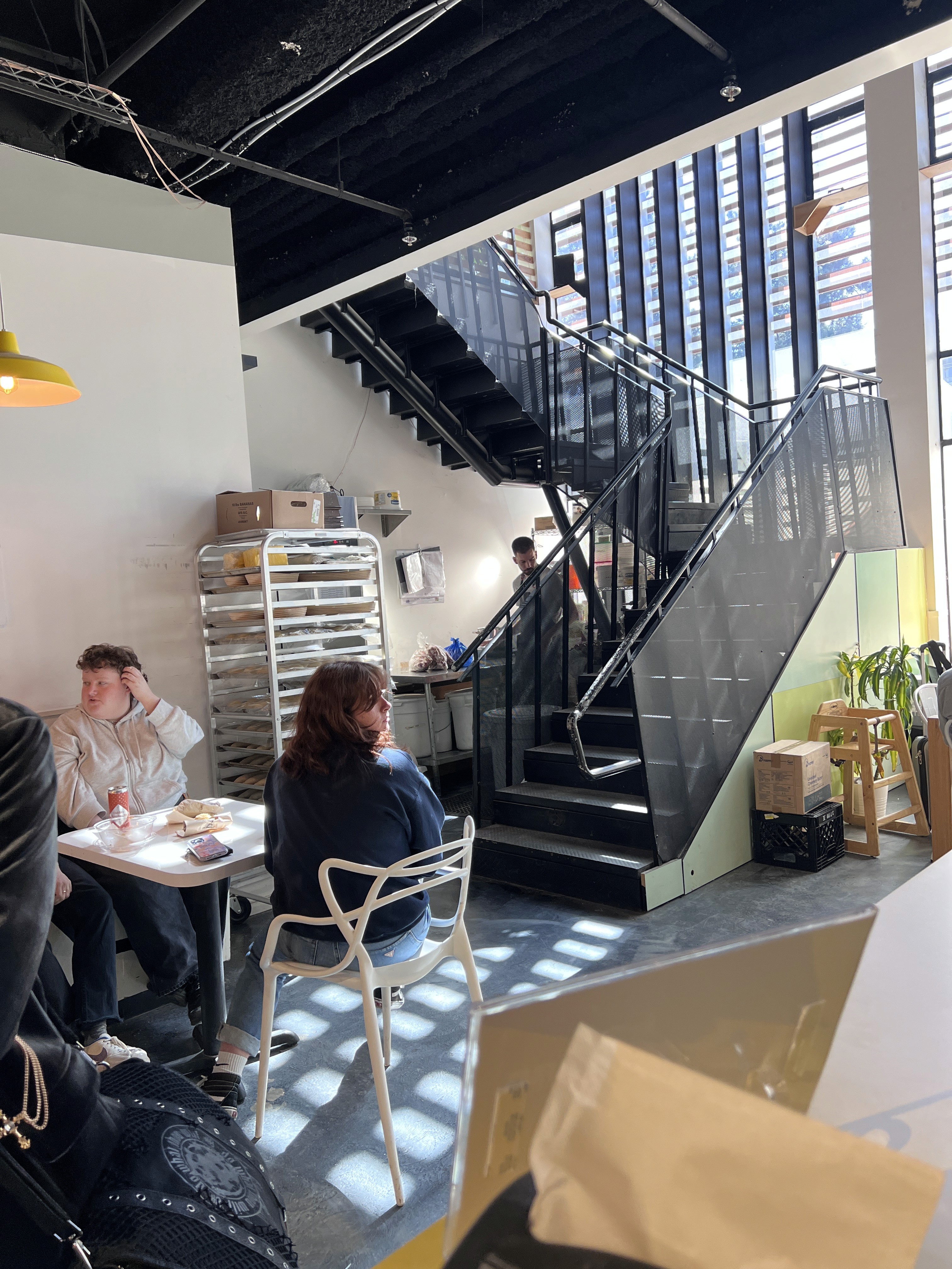
To understand the friction points, I dedicated four days observing the cafe during the morning, lunch rush, and pre-closing times.

What's Kafka's charm?
What is the nature of interactions between people, objects, and space?
Who is there? What is their role and behaviour?
What do the customers do?

Root of the Problem
After interviewing the cafe employees and owners, we discovered that the business had been slow for the cafe after the pandemic.
To help bring in more foot traffic, our first priority was still to incentivize the regulars and people who know and have tried Kafka to return to the cafe. Whether that be the experience overall, the interactions, the food or even events.
We funeled it down to three key focuses:
Efficient ordering
Minimizing confusion of the ordering process
Visual affordances
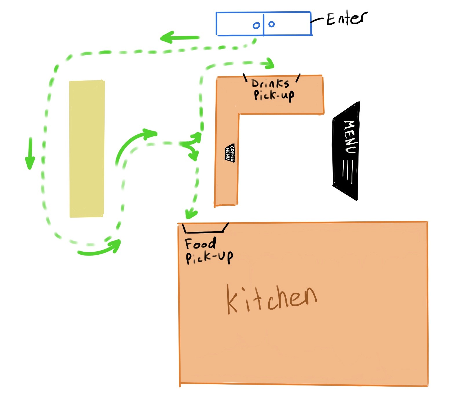
Easy navigation via signage changes and flow orientation.
Community building
Emphasizing Kafka's artistic and community-driven brand
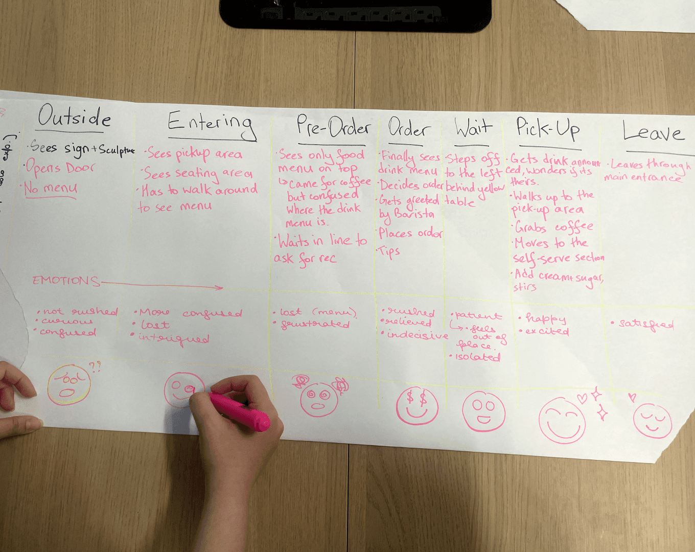
Based on the interviews, I developed tangible representations of the customers in the form of personas.
For the case of redesigning the cafe's orientation flow, we wanted to really take into account the busy student archetype who needs a clean and efficient way to order her morning cup of Joe.
Sarah
Single
Vancouver
Student
20 years old
Goals:
Find a comfortable and inspiring environment to study, work on projects, or relax between classes
Discover a go-to coffee shop that meets her needs and preferences
Build connections and socialize with fellow art students and creatives.
Frustrations:
Overwhelming and disorganized menu, making it hard to decide on a drink or snack
Inefficient and confusing ordering process
Lack of transparency in pricing, leading to unexpected costs.
Needs:
A clear and efficient process for queuing, waiting, ordering, and receiving their order
Transparent pricing for all items, including desserts, to make informed choices and avoid surprises
A friendly and helpful staff that can guide them through the process and address any concerns or questions.
Interests:
Art, design, and creativity
Discovering new places to study, relax, and socialize
Trying new and unique coffee flavors and pastries
Sustainable and eco-friendly practices.
With identifying the user's pain points, we went to problem ideation…
Problem solving
Here are the design-driven implementations we came up with:
Changing the layout for a more clear flow
Maps
3D models
Sketches
Connecting the art and cafe mix of kafka:
Events
Posters
Booklets
Competitions
Adding more menus for better experience pre-ordering
Design menus
Mockups
Signage for clear flow
Design signs for order pick up
Navigation visual affordances
Kafka has an established reputation for signal-boosting local artists through selling local artwork and decor.

Implementing the in-house 'Coffee Cup Drawing' and 'Urban Sketches' programs will give customers an opportunity to express their creativity and imagination while enjoying a cup of coffee in a social setting.
By providing a fun and engaging experience, we aim to create a memorable and positive atmosphere and association with our coffee shop.
Additionally, these events can help increase foot traffic while attracting new customers!
Kafka's prior menu


